Web Redesign:
Complex System Design:
Revamping Ryanair's Website
Revamping Ryanair's Website
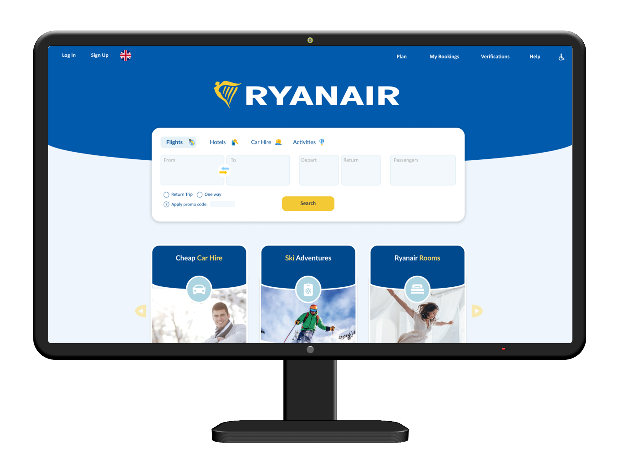
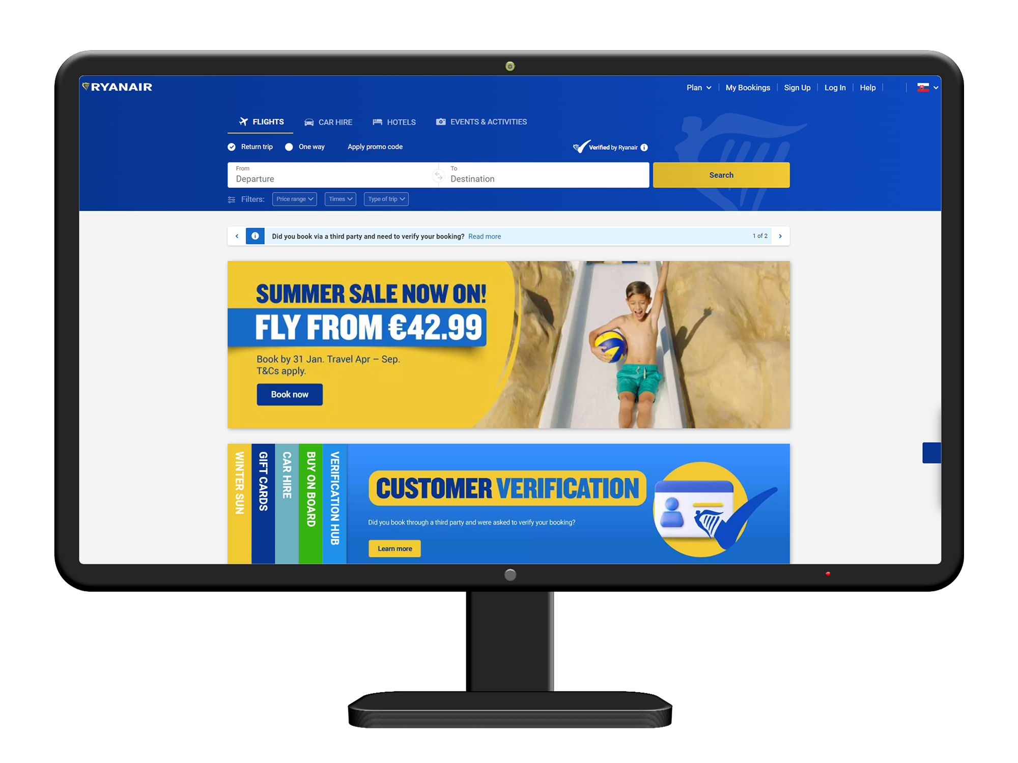
Before & After


Before & After


Project Overview
Project Overview
Idea and Inspiration
The idea for redesigning Ryanair’s website stemmed from my personal frustration as a frequent traveler. Navigating Ryanair’s existing site was often confusing, with cluttered layouts, unintuitive navigation, and a lack of coherence in user flow. Recognizing the opportunity to enhance user experience (UX) and usability, I embarked on this redesign project to simplify the booking process, and ultimately make flying with Ryanair a smoother and more enjoyable experience for all users.
Considerations
Throughout the project, I prioritized clarity, simplicity, and efficiency. Streamlining the booking process was central, ensuring users could easily find flights, manage bookings, and access essential information without unnecessary friction. Visual hierarchy, intuitive navigation paths, and responsive design were crucial considerations to accommodate users across different devices and ensure a seamless experience from start to finish.
Best Practices Applied
Implementing best practices in UX design, I focused on creating a clean and minimalist interface that guides users through each step of their journey. This included optimizing form layouts, improving error handling, enhancing search functionalities, and integrating user-friendly interactive elements.
Through this project, I aimed to demonstrate how strategic UX design can transform a challenging user experience into one that is intuitive, efficient, and enjoyable, ultimately elevating Ryanair’s digital presence and enhancing user satisfaction across their customer base.
Inspiration and Idea
The inspiration for redesigning Ryanair’s website arose from personal frustration with its cluttered layout and confusing navigation. I aimed to simplify the booking process and improve the overall user experience.
Project Creation
Driven by my passion for UX design, I conducted thorough research, user testing, and competitive analysis to identify pain points. This guided the redesign to focus on clarity, simplicity, and efficiency.
Considerations
Key considerations included optimizing navigation, and improving usability across devices. The goal was to create a seamless journey for users from flight search to booking.
Best Practices Applied
I implemented best practices such as intuitive interface design, and streamlined booking flows. The result aimed to transform a challenging experience into a user-friendly one, enhancing Ryanair’s digital presence and user satisfaction.
