Understanding the Problem
Organizing events is a time and energy-intensive task, and most of the time, at the end of this laborious process, not all attendees are satisfied.
Designing a user-friendly versatile Event Planning application that centralizes suppliers and checklists by event type, facilitates communication among organizers and guests, allows the invitees to express their preferences, and streamlines money collection among other features.
The Solution Journey
Surveys
At the beginning of the project, I built an online survey to identify the user’s challenges. The survey included open-ended and multiple-choice questions regarding fundraising, selection of suppliers and other aspects of event planning. I distributed the survey on social networks, and within a few days, 51 responses were received. The findings served as key insights in refining the features of the application.
Persona
In order to gain a profound understanding of my users’ goals, experiences and challenges, I crafted 4 personas, each featuring a typical quote, goals, story, and frustrations. These personas were derived from user interviews and continuously updated throughout the project as more data was collected. They served as valuable tools to step out of my perspectives and reassess initial ideas.
Wireframes
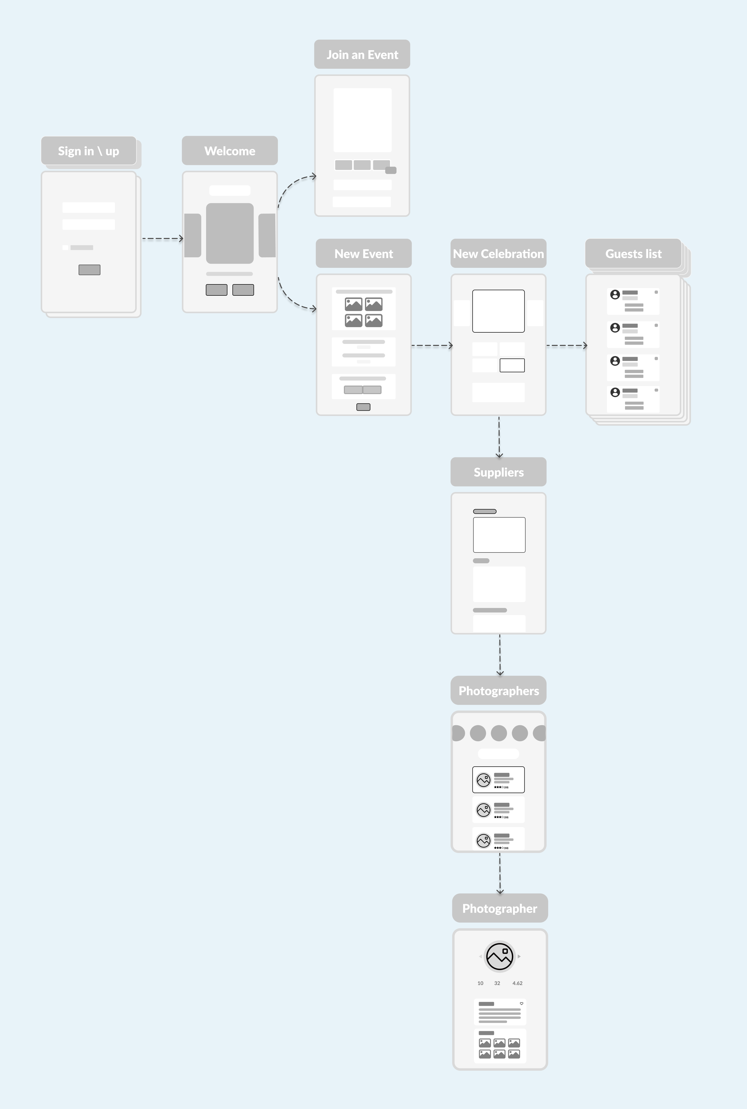
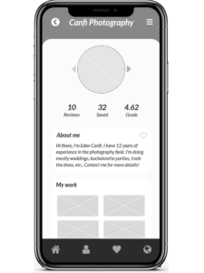
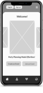
Using Axure, I transformed my initial sketches into low-fidelity wireframes. Enhancements were made by incorporating relevant icons, rendering the wireframes detailed enough for initial user testing. Following feedback from five tests, I implemented adjustments and progressed to developing high-fidelity prototypes.
Usability Testing
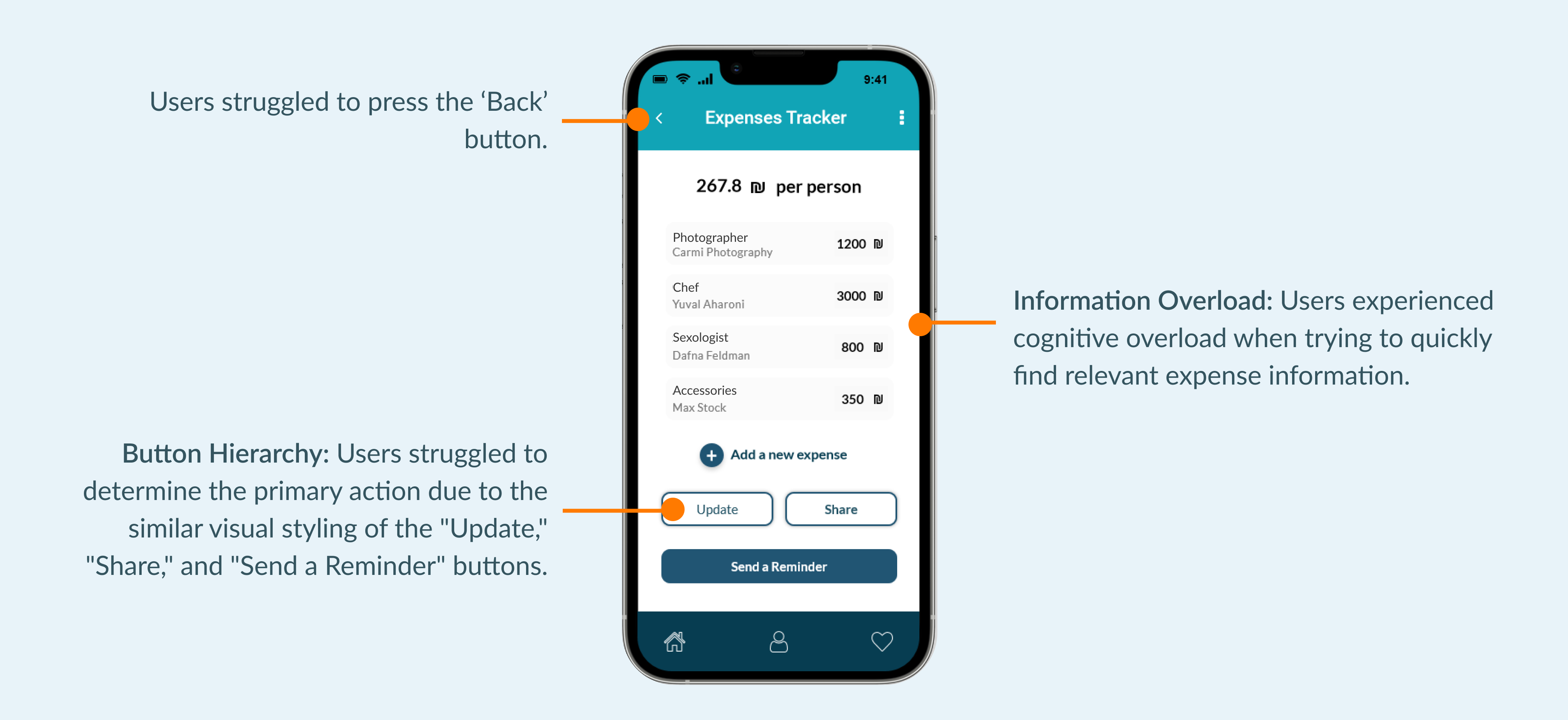
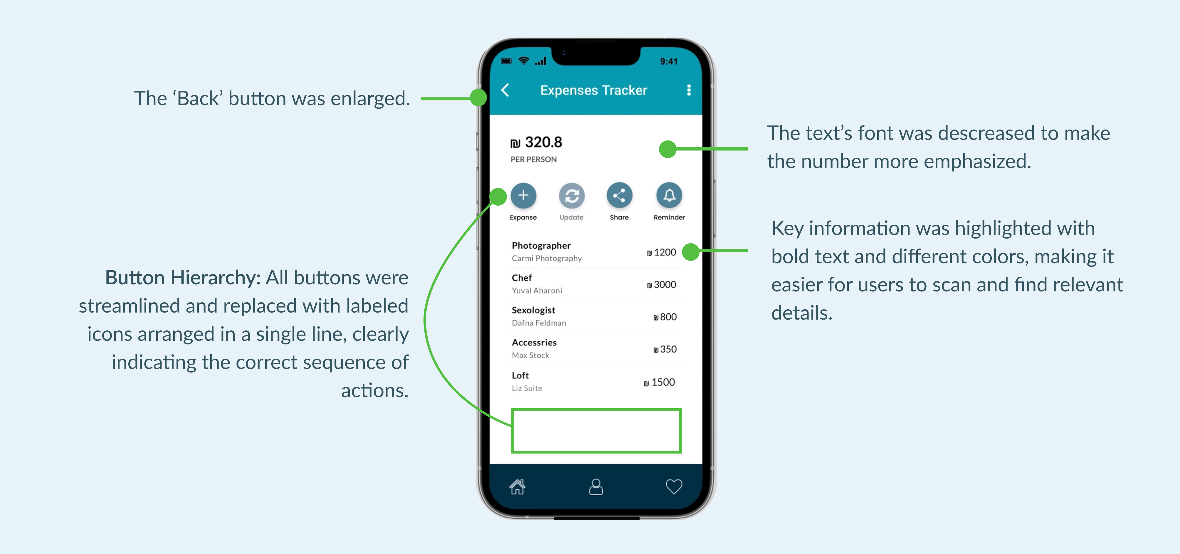
I created a fully functional high-fidelity prototype of the new flows using Axure. At the same time, I started recruiting subjects for the test who fit the criteria. I did 5 usability tests in the first run and 3 after iterating on the issues that I have identified.
For example:
Solutions:
UI Design
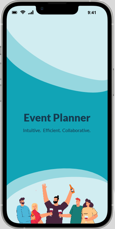
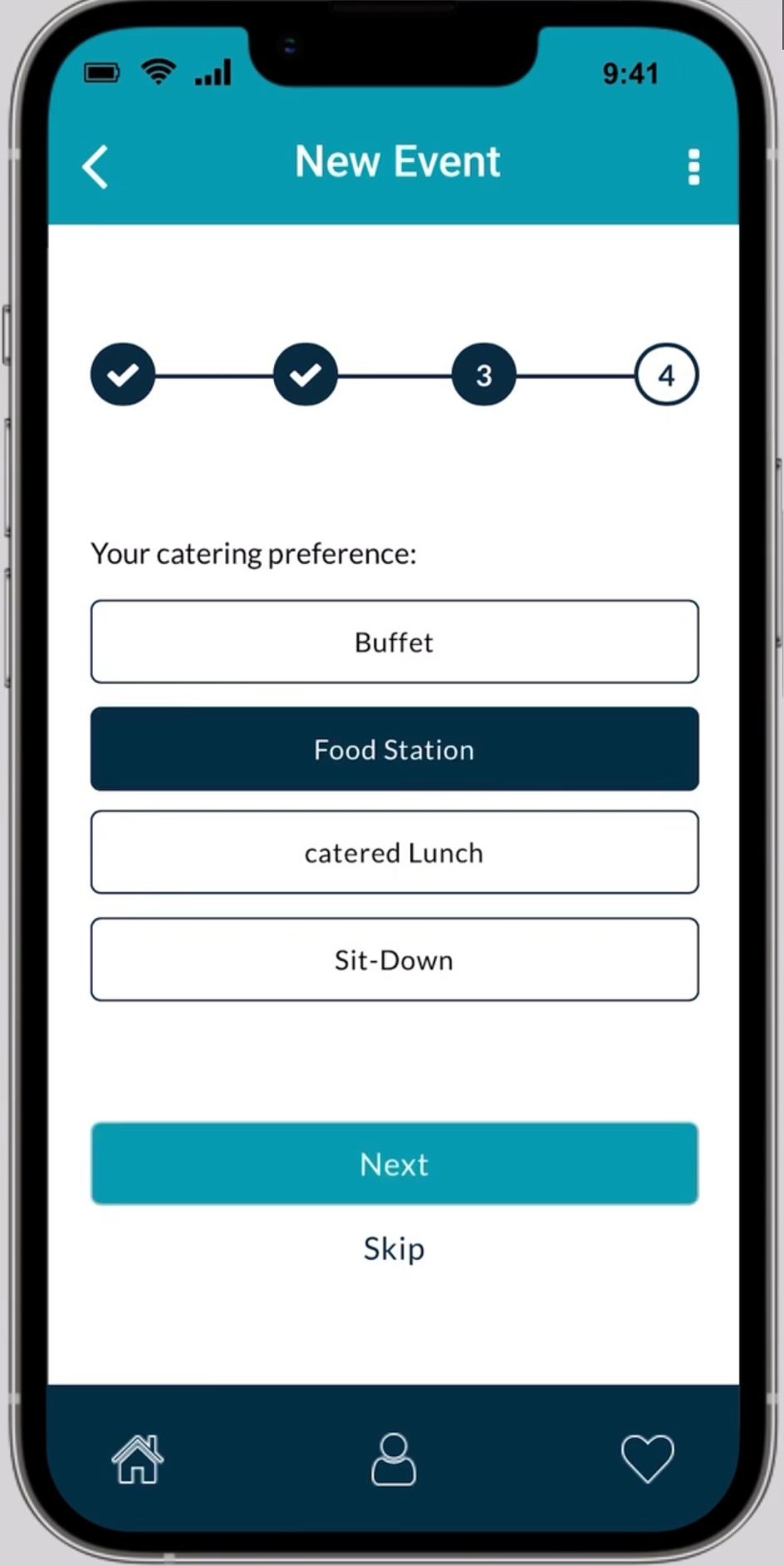
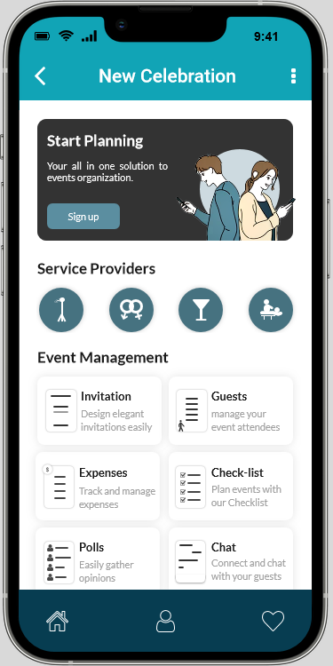
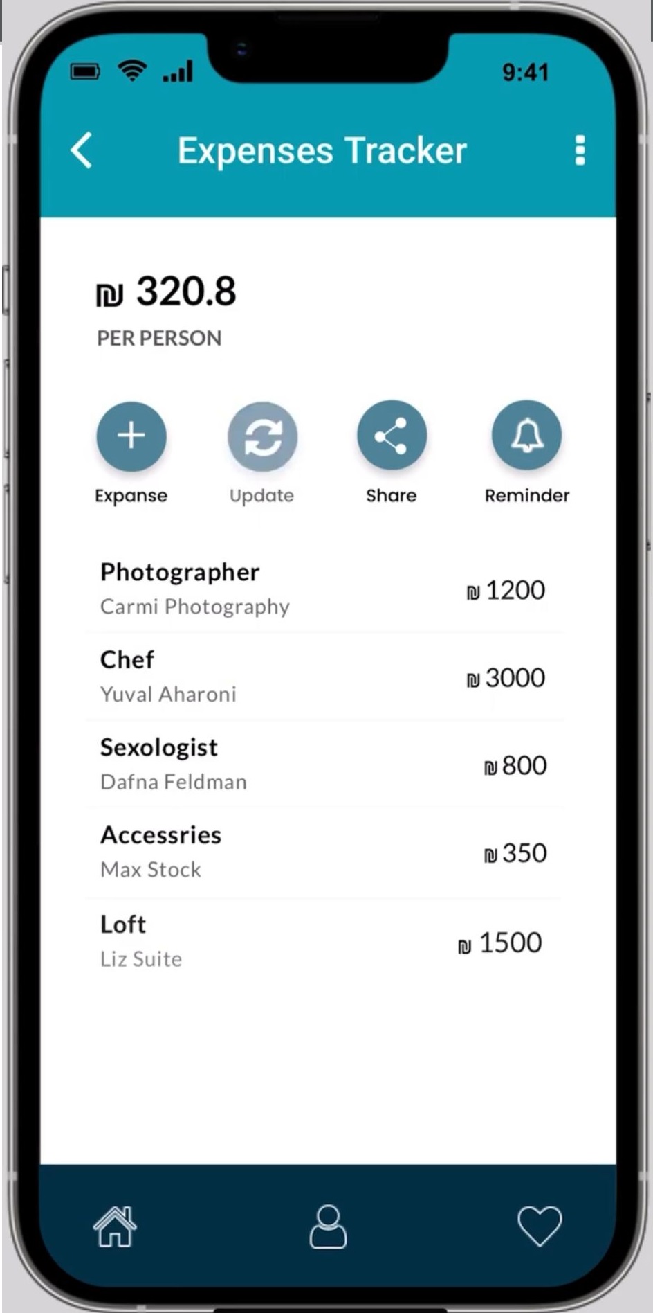
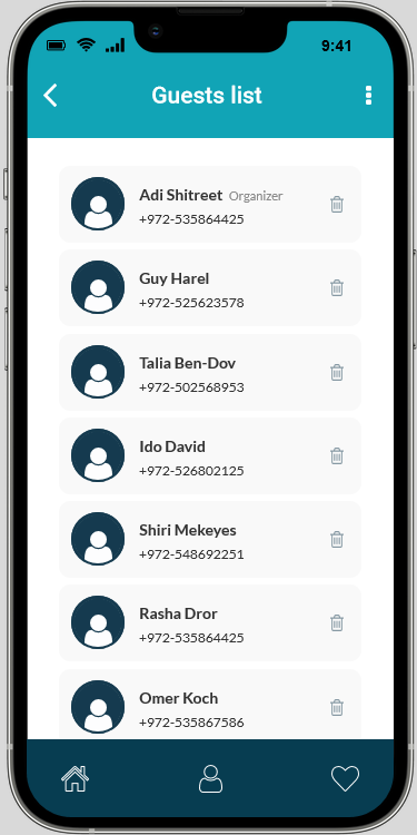
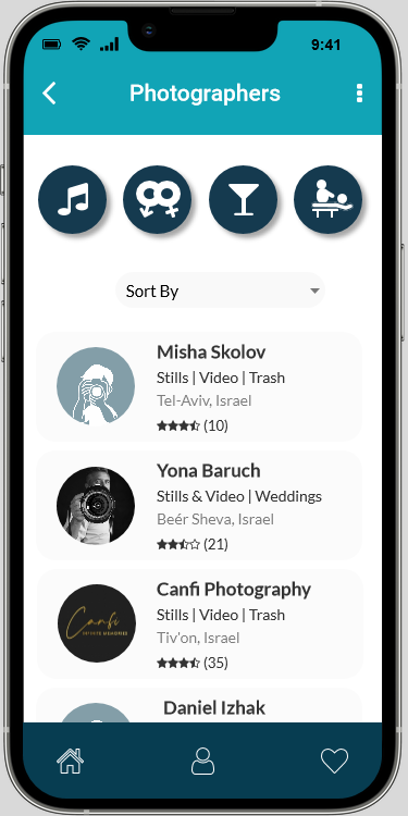
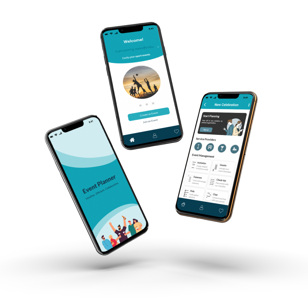
Once the usability issues were resolved, I moved on to design the final screens in Axure. I followed a clean and modern style to convey professionalism and maintain a visually appealing interface. The chosen color palette is associated with celebration and joy. I prioritized intuitive navigation with a user-friendly layout, clearly labeled sections, and used recognizable icons to enhance usability. I strategically used font sizes and styles to guide users through the content. With a user-centric approach, I considered users’ preferences, behaviors, and needs to create a personalized and enjoyable experience.
Mobile Application Design:
Event Planner
Understanding the Problem
Organizing events is a time and energy-intensive task, and most of the time, at the end of this laborious process, not all attendees are satisfied.
Designing a user-friendly versatile Event Planning application that centralizes suppliers and checklists by event type, facilitates communication among organizers and guests, allows the invitees to express their preferences, and streamlines money collection among other features.
The Solution Journey
Surveys
At the beginning of the project, I built an online survey to identify the user’s challenges. The survey included open-ended and multiple-choice questions regarding fundraising, selection of suppliers and other aspects of event planning. I distributed the survey on social networks, and within a few days, 51 responses were received. The findings served as key insights in refining the features of the application.
Persona
In order to gain a profound understanding of my users’ goals, experiences and challenges, I crafted 4 personas, each featuring a typical quote, goals, story, and frustrations. These personas were derived from user interviews and continuously updated throughout the project as more data was collected. They served as valuable tools to step out of my perspectives and reassess initial ideas.
Wireframes
Using Axure, I transformed my initial sketches into low-fidelity wireframes. Enhancements were made by incorporating relevant icons, rendering the wireframes detailed enough for initial user testing. Following feedback from five tests, I implemented adjustments and progressed to developing high-fidelity prototypes.
Usability Testing
I created a fully functional high-fidelity prototype of the new flows using Axure. At the same time, I started recruiting subjects for the test who fit the criteria. I did 5 usability tests in the first run and 3 after iterating on the issues that I have identified.
For example:
Solutions:
UI Design
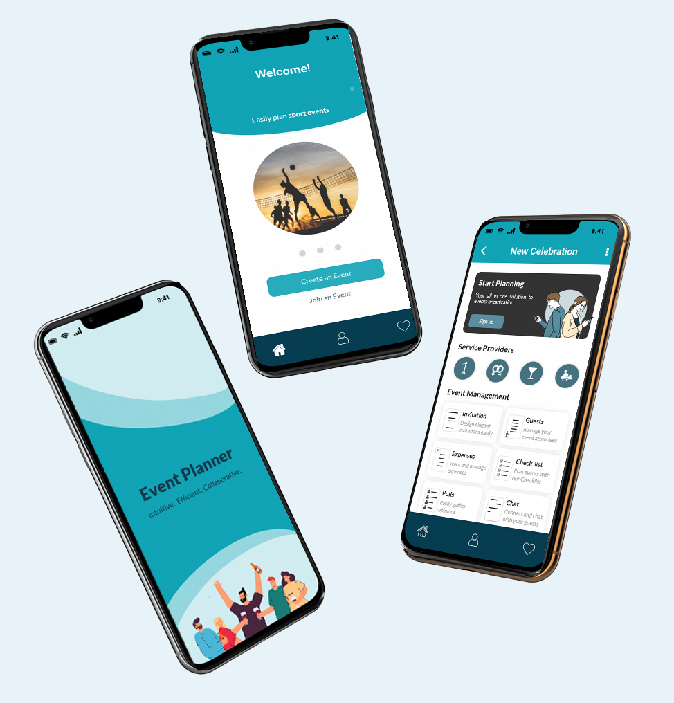
Once the usability issues were resolved, I moved on to design the final screens in Axure. I followed a clean and modern style to convey professionalism and maintain a visually appealing interface. The chosen color palette is associated with celebration and joy. I prioritized intuitive navigation with a user-friendly layout, clearly labeled sections, and used recognizable icons to enhance usability. I strategically used font sizes and styles to guide users through the content. With a user-centric approach, I considered users’ preferences, behaviors, and needs to create a personalized and enjoyable experience.
